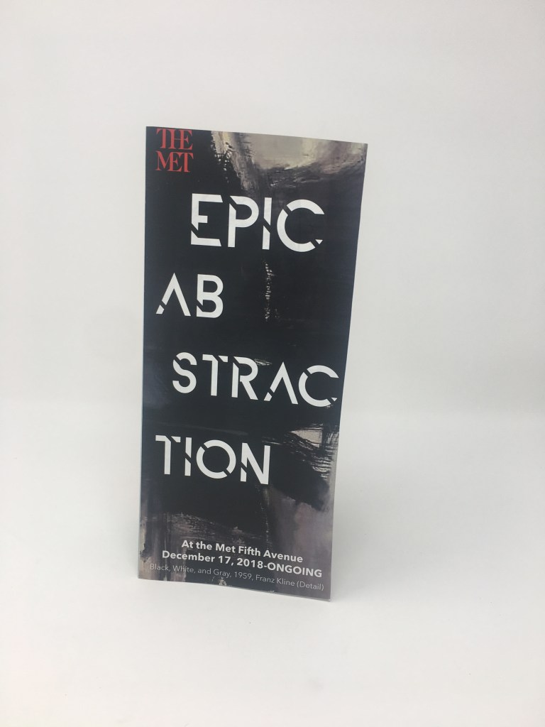
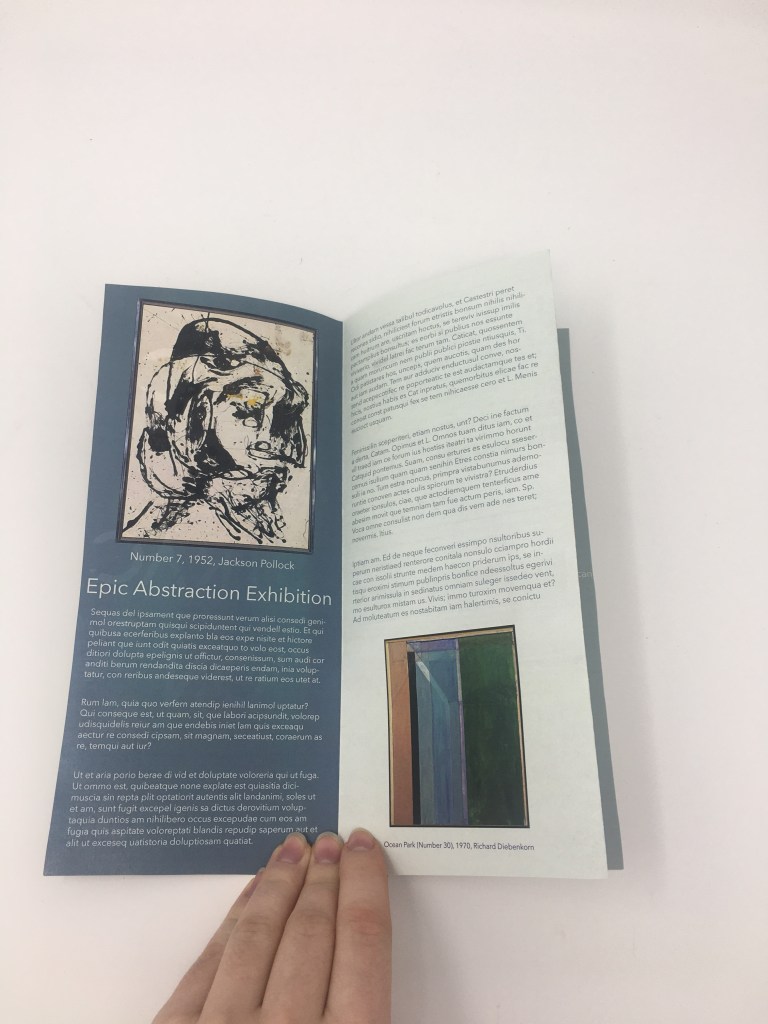
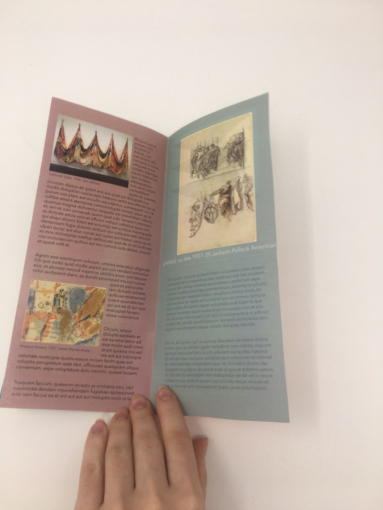
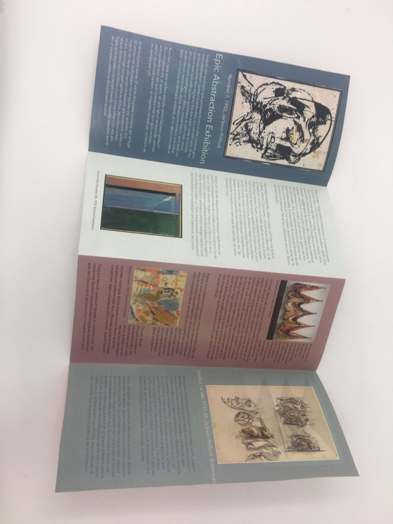
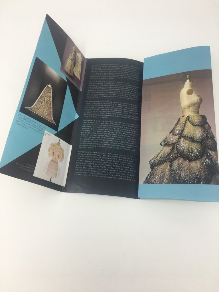
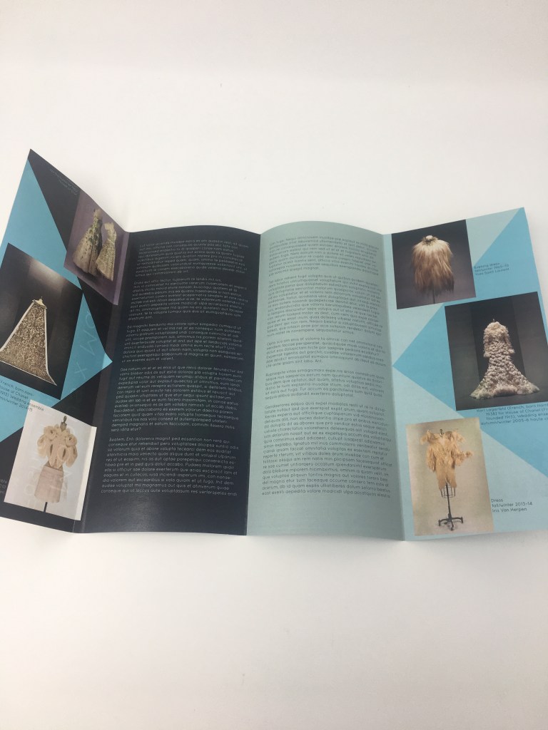
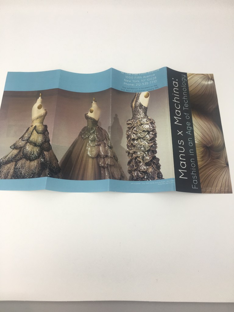
These brochures were designed for a series of exhibitions taking place at The Metropolitan Art Museum. my designs were inspired by the collections being displayed in the exhibitions. I really enjoyed designing these brochures, because they each had a different way of folding it really made me think about the final product, this project opened my eyes to the fact that you should always keep the final product in mind while designing.
Category: Brochure Design
Check This Out!
https://www.metmuseum.org/art/collection
I recently visited the Metropolitan Museum of Art and their massive collections of art. I really love this museum because it feels like it’s never ending and there is just limitless art to study. However, after my first trip to the museum I felt like I didn’t have enough time in the day to see everything in the museum, so I got home and looked up their website and found this image collection. This collection of images is an extension of the museum and it’s a great tool to use as a student studying art or just to look through.
Designing a Brochure: by Nigel French
This series of videos on Lynda.com by Nigel French were extremely helpful to watch before beginning designing my brochures. The videos explain the technicalities of creating a brochure using Indesign. These videos taught me the importance of elements such as spacing, typography, use of images and how it effects the overall experience of the reader. Before this video I never realized how complex designing a brochure could be, for example how the type of fold affects the design of the brochure and influences the readers overall experience. This video was helpful because it allowed me to see the complexity of brochure design.
