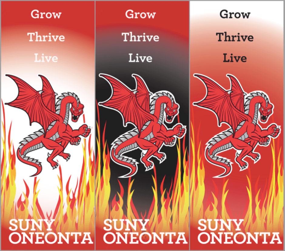
This design was intended for the the banners on the campus at SUNY Oneonta. For this design I wanted to stay on brand with the colors and imagery, I decided to use the dragon as the main focus of the banner because I feel that that part of the SUNY Oneonta brand is lacking around campus. This process took me awhile, I played with other fonts and images but in the end I decided that the red dragon image should be on the banner because it’s an important part of the brand that doesn’t seem to get enough attention. My concept for this design was to have a readable, attention grabbing, yet on brand banner.