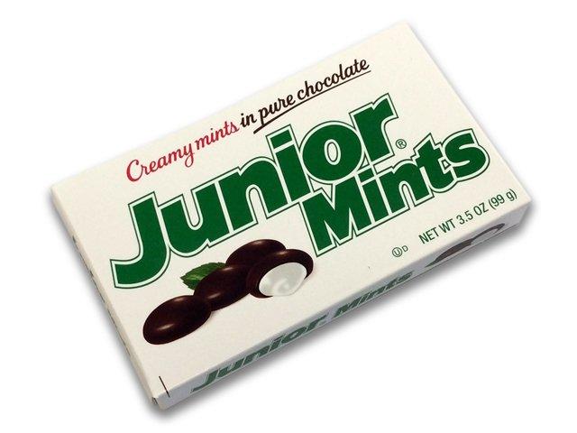

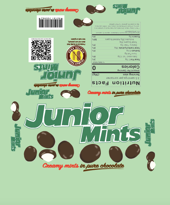
I decided to redesign the “Junior Mints” candy box because the design seemed like it was old fashioned and should be revamped. I wanted to add movement and add the mint green color to give the box a more playful and modern feel.
Category: Packaging Design
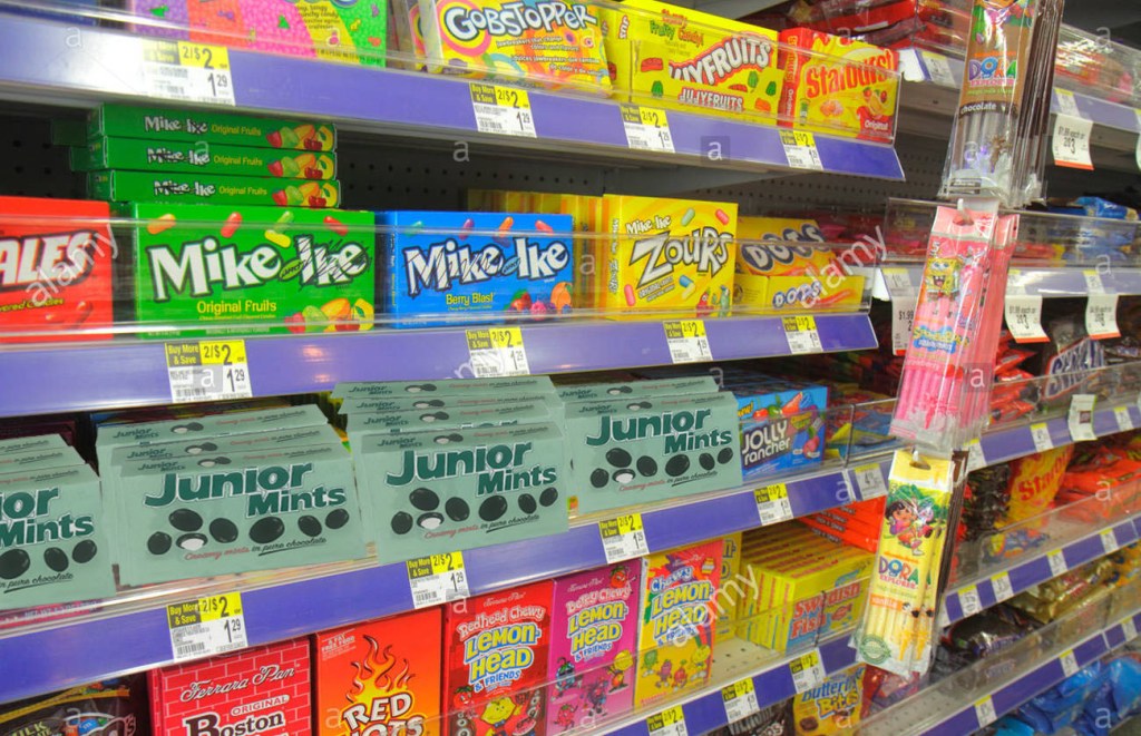
Packaging Research: Trip to Hannaford’s
1.What are the products your category is shelved with? In what part of the physical store do they get placed (ex: a center aisle or outside edge parameter.) What is the packaging of these products like? What do they have in common. Is there a general personality for these products? Do you see certain elements or motifs repeated amongst the products?
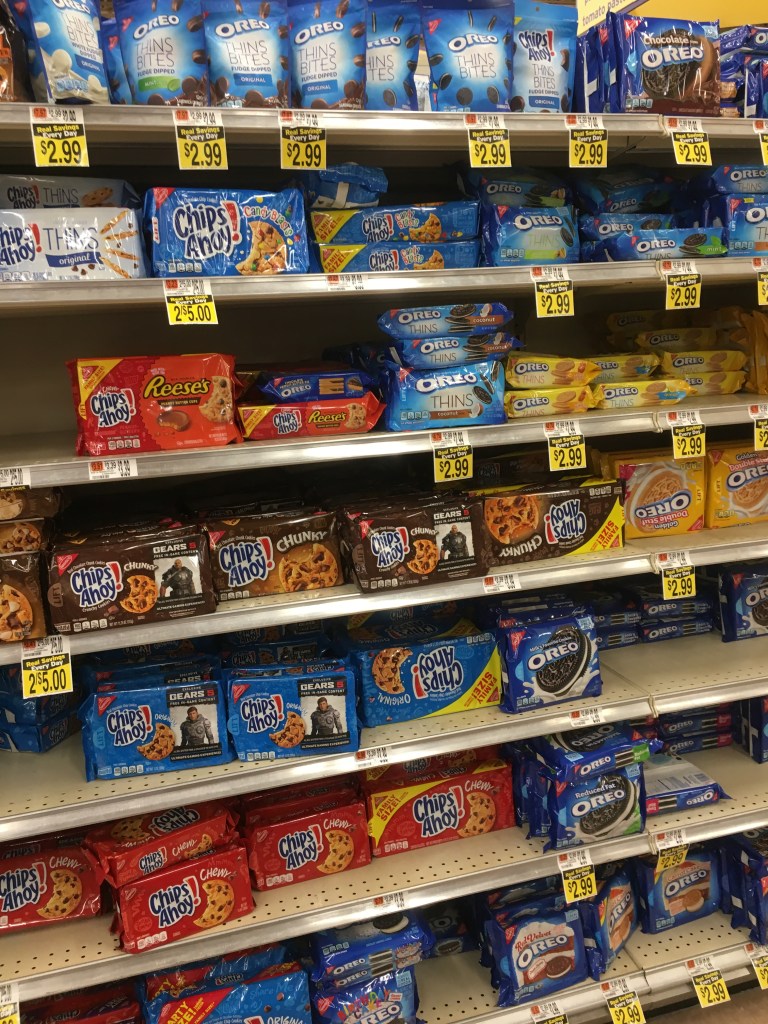
I was assigned to research and design a cookie or candy product, the cookies were shelved with crackers and juice and other snack items. Candy was shelved with sodas iced tea water and other beverages. the packaging for these type of products have lots of movement bold colors and large logos and stylized typography. Cookies and candy were placed in adjacent aisles in the center of the store
Amongst the products in your category, which is the nicest example(s) of packaging of this type of product? Is there a package there that is innovative and shows a greater emphasis on design?
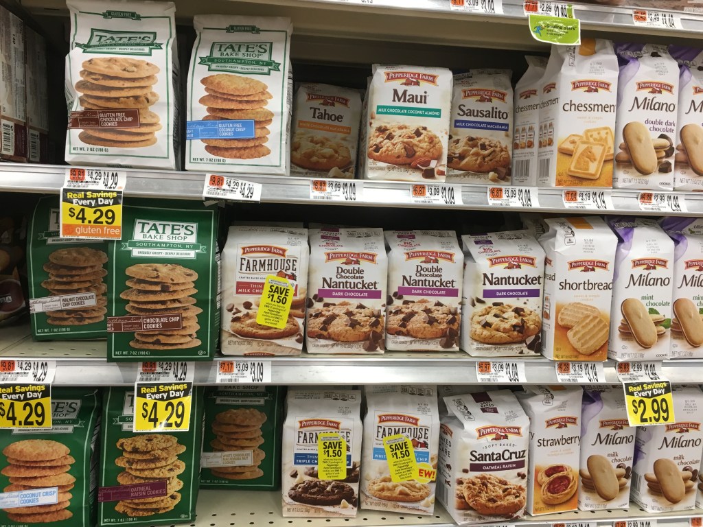
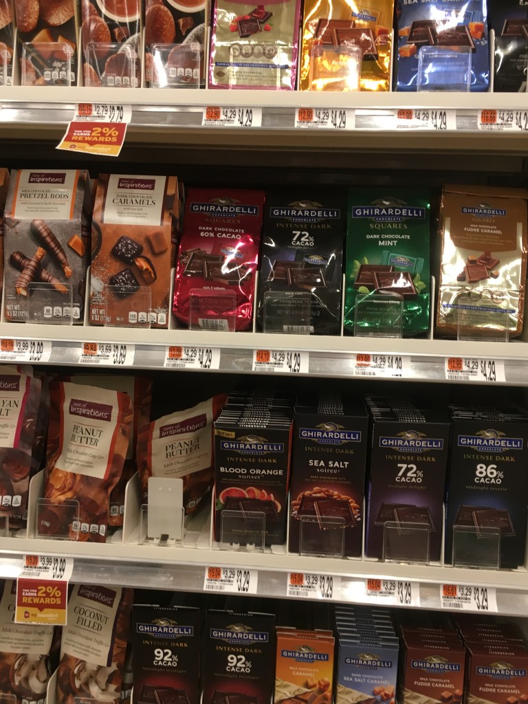
When it comes to cookie the more expensive cookies typically came in bags with a lower quantity of cookies per bag. For the candy packaging the nicest example was the more expensive chocolates like Ghirardelli chocolate. From what I saw not many packages were very innovative.
Is there an established color scheme that consumers are familiar with for this type of product? (example: blue for some brands of pasta, red for others. Cleaning products extremely neon bright)
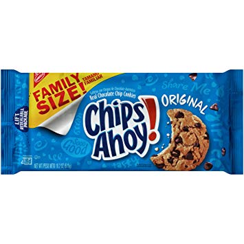
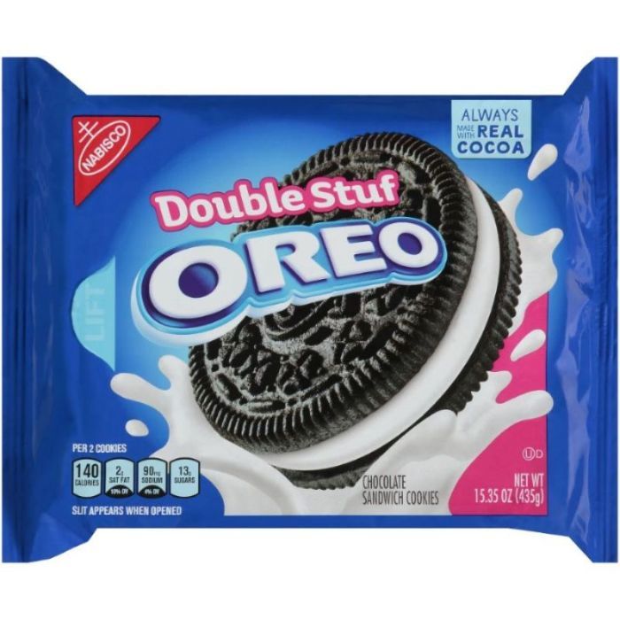
When it comes to cookies many consumers are familiar with blues and large, bold typography for cookies such as “Chips Ahoy” and “Oreos”. When it comes to candy Consumers are familiar with orange for “Reese’s” and yellow for “Sour Patch Kids.”
What are the established branding conventions (things that consumers relate to, or are very familiar with) of the graphics that are too important to loose in a redesign?
For the more popular products color schemes are hard to stray from because consumers are so accustomed to their favorite candy or cookie being packaged in specific colors.
What typography conventions are used?
Many candy and cookie brands use large, bold and playful typography.
Is there any graphic element that is designed to connect in a repetitive pattern when there are multiple packages lined up next to each other on the shelf. (for example a wave shape of color that creates many waves when 8 of the same box are next to each other on a shelf.
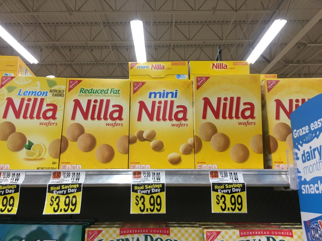
I found an example of a pattern on “Nilla” cookie boxes.
Is there a package that is engineered in a innovative and inspiring container. There are many new technologies being used in package design. (example: see enspired chocolate and soymamelle) Make notes.
I didn’t notice any innovative container design for cookies or candy. some more popular candies are now in resealable pouches but I don’t know if that’s necessarily innovative.
Is it an areas of consumer goods that seems to be embracing new and innovative packaging?
No, all of the brands for cookies and candy seem to stick to pretty basic packaging.
Is there an example in the category that seems to be stuck in an older era of packaging and needs new design?
I think many of the cookies and candy brands have moved toward more modern design but there are also a few that could be redesigned to be more modern.
How many different substrates (material the package is made of) can you notice?
I only noticed cardboard and plastic being used for most of the packaging as well as paper bags for some of the cookies.
How many different specialty printing methods such as the use of metalic foil, embossed (protrudes from the surface), debossed (recedes from the surface) can you notice?
I didn’t really notice any specialty printing methods that stuck out to me.
Article from The Dieline
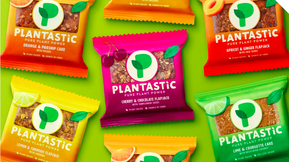
I really enjoyed the design created for this plant based product called “Plantastic.” It really exemplifies how a package design can be playful and yet cleanly designed at the same time. I enjoy this design because it emphasizes the how important it is to the brand that people know their products are all natural and plant-based. This is evident based on the the pictures of the fruit and pictures what the product looks like on the front of the package. The use of bright colors and the gradient makes the package visually pleasing and makes them appear unified.
Skillshare Courses about Packaging
https://www.skillshare.com/classes/Package-Design-II-Step-by-Step-Execution/1068714532/projects
After watching these videos by Skillshare teacher Trina Bentley I learned about all the different factors that go into packaging design. When designing packaging there are many aspects that need to be put into consideration. For example, the audience, the style of packaging, color scheme, typography, specific labels that the package is required to have and many other aspects need careful consideration when it comes to taking on a package design. One key point the she made was about how the brand name and the product name are the most important and should have the most visual weight. She also made a good point about how if you’re designing packaging for a product with different flavors you have to clearly differentiate the flavors. I like how she designs her packages for one brand to look like they belong together even though there’s a variety of products the brand makes.
