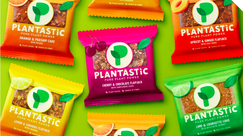
I really enjoyed the design created for this plant based product called “Plantastic.” It really exemplifies how a package design can be playful and yet cleanly designed at the same time. I enjoy this design because it emphasizes the how important it is to the brand that people know their products are all natural and plant-based. This is evident based on the the pictures of the fruit and pictures what the product looks like on the front of the package. The use of bright colors and the gradient makes the package visually pleasing and makes them appear unified.